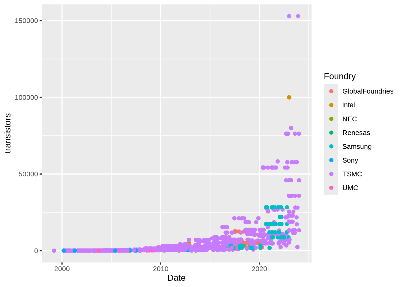
With R being more popular than ever, the default ggplot2 theme is everywhere. In addition to being overused, the grey background can be a bit much. ggplot2::theme_minimal is an easy substitute and a great base for further customisation, but I really like hrbrthemes::theme_ipsum.
Use an effective colour palette
Effective use of colour can ensure that your plots are able to be interpreted at a glance. The viridis palettes help to ensure that different values are distinct, and are colourblind-friendly. Like the base ggplot2 theme, viridis palettes are everywhere, but it’s a hard choice to argue with!
Modify your theme
Even though we’ve chosen a great theme, it’s still important to consider whether it perfectly suits you needs. For example, I often like to drop the x-axis gridlines for a cleaner look. I will also place the legend below the plot, to allow the main contents to fill the page.
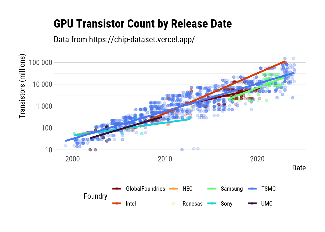
We’ll apply the tips described above, as well as rescaling the y-axis and adding some trendlines. Do you think this is a more effective figure?
```{r}#| dev: "CairoPNG" #| label: feature-image#| fig-cap: "The final figure"library(hrbrthemes)library(sysfonts)library(viridis)library(scales)font_add_google("Roboto Condensed")chips |> ggplot(aes(x = Date, y = transistors, color = Foundry)) + geom_point(alpha = 0.2) + geom_smooth(method = "lm", se = FALSE, alpha = 0.5) + scale_colour_viridis_d(option = "H", direction = -1) + scale_y_log10(labels = label_number()) + theme_ipsum_rc(axis_title_size = 12) + theme(legend.position = "bottom", panel.grid.major.x = element_blank(), panel.grid.minor.x = element_blank()) + labs(y = "Transistors (millions)", title = "GPU Transistor Count by Release Date", subtitle = "Data from https://chip-dataset.vercel.app/")```